Let's Talk About Colour
Let’s talk about colour. It seems to be either something we love or something we dread. We often believe that we are either “good” or “bad” at putting colours together. But just like most things, we can learn.
I am not going to discuss colour theory, I’ll leave that for the people who can explain it better than I understand it! What I will talk about in this post is confidence, the world around us and playing. I’ll tell you how I pick colours and hopefully give you some resources to build your own sense of colour.
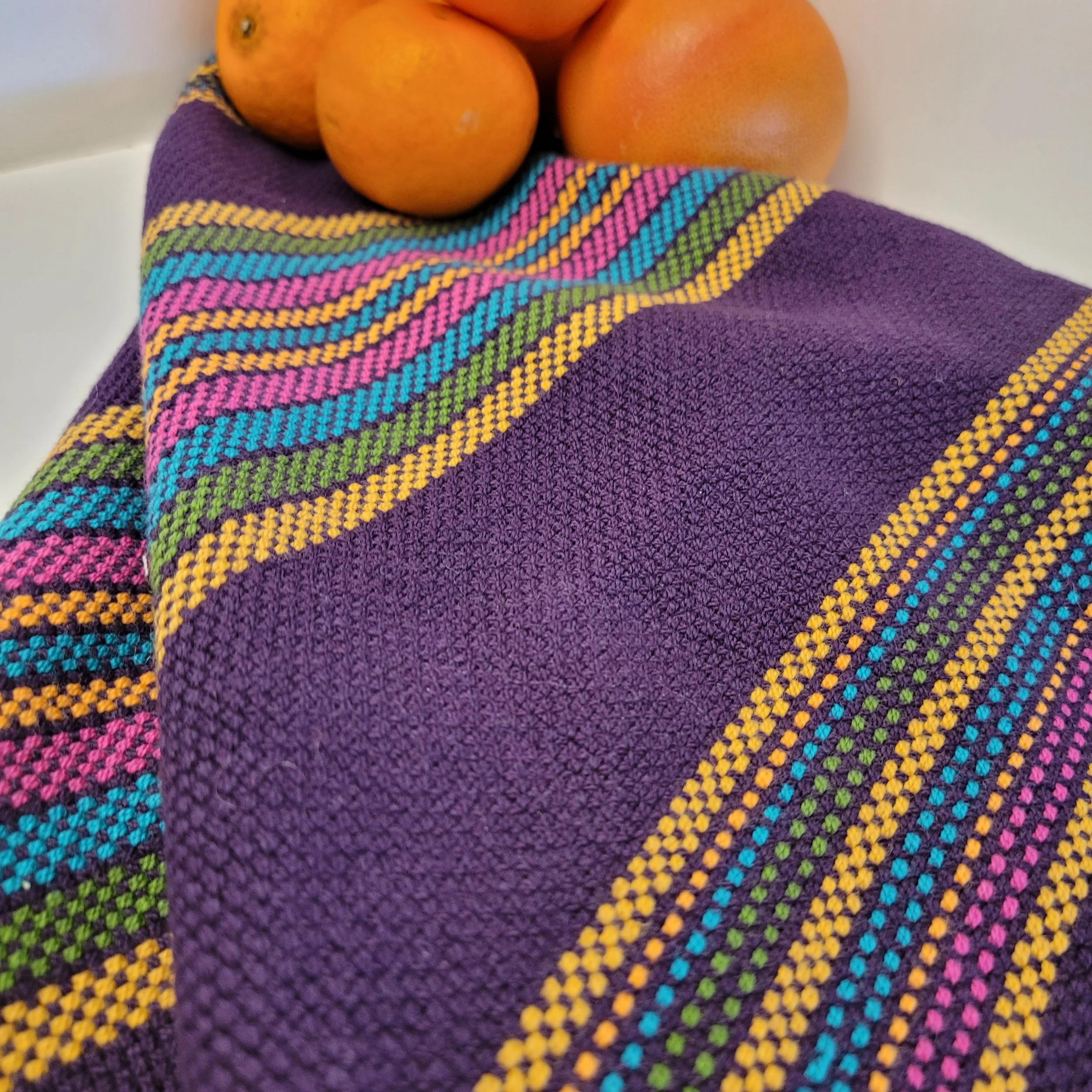
First, colour is highly individual. It is likely that a colour combination that you don’t like will be loved by someone else. And what you love will horrify someone else. I grew up having been taught that orange and pink do not belong together—ever! (My mom has some very strong opinions.) Imagine my initial shock when I saw a woman wearing a one-piece pantsuit with the left side a bright fuschia pink and the right side the brightest of hunter oranges I had ever seen! My internal dialogue had to quickly recalibrate (Doesn’t she know better? What confidence! Wow, that’s really beautiful!) Now, I’m still not an orange/pink combo kinda person, but I admit it can work and even used them in the same project a time or two.

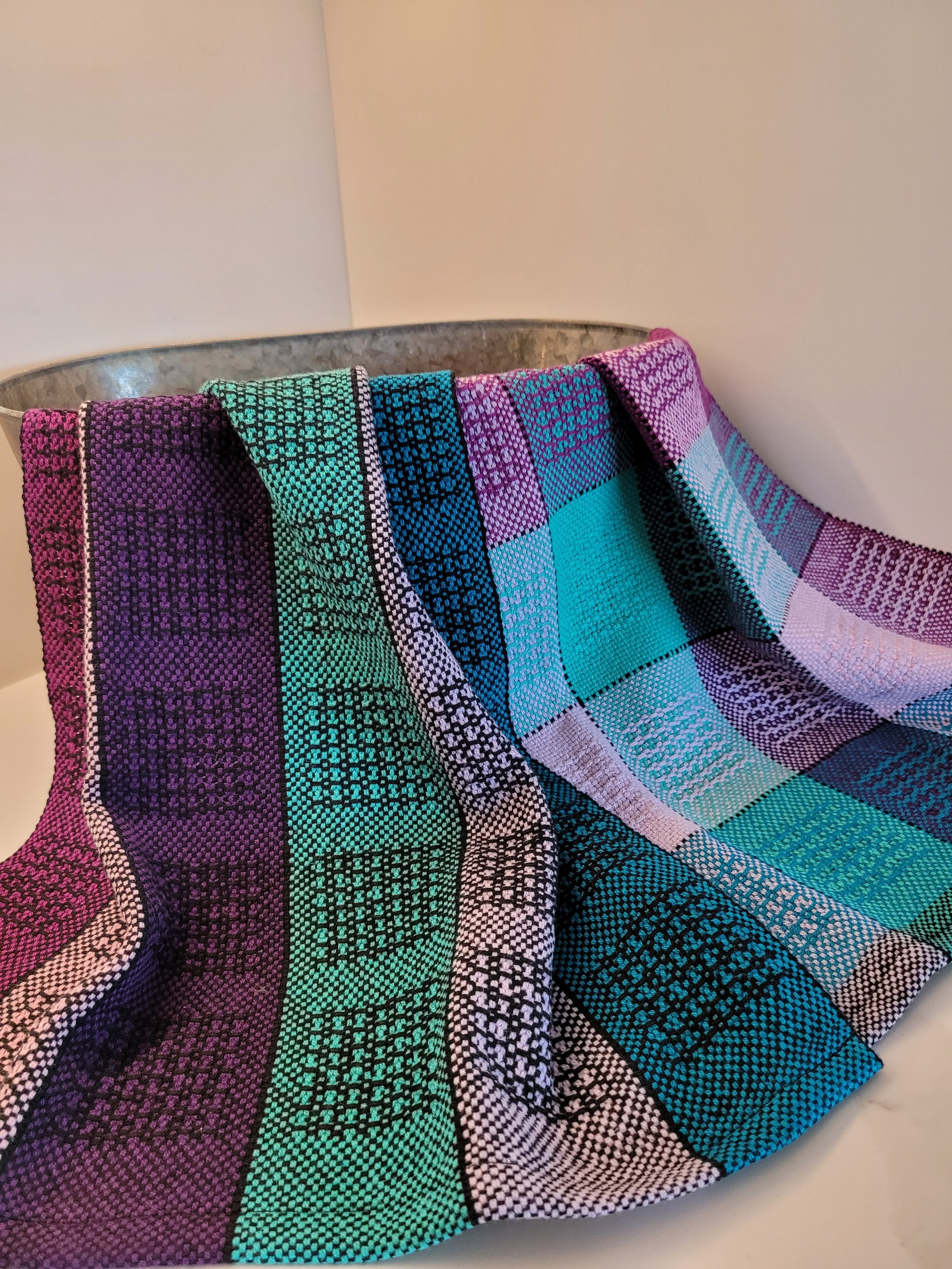
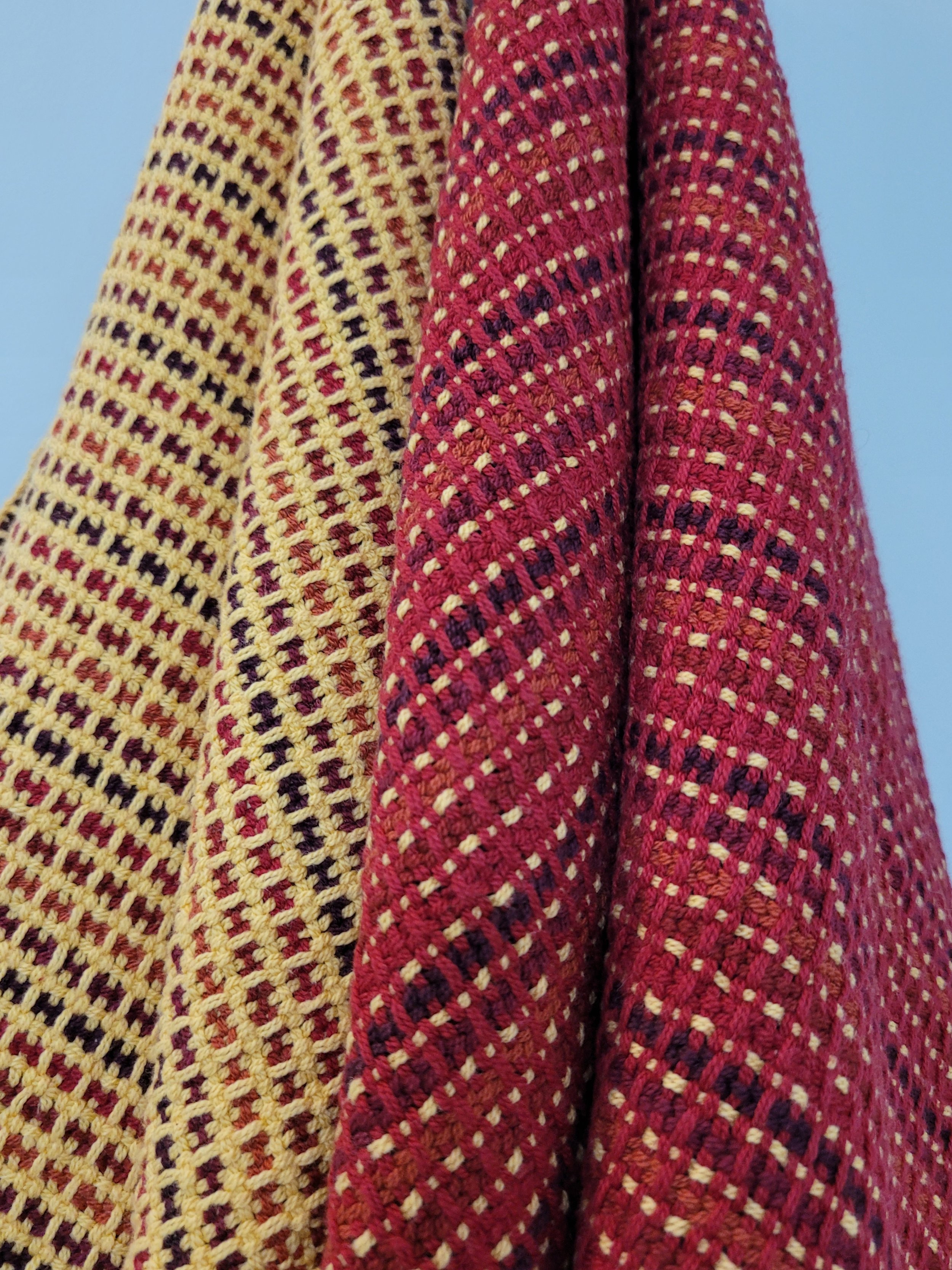
So my first word of advice is to let go of all your preconceived notions about colour. Approach colour with a “no holds barred” attitude. If you need help with this, go look at nature. I’ve never heard someone, when viewing a field of wildflowers, complain that the flowers clash! (If you can’t get out to see nature, check out wildflower pins on Pinterest.) I sometimes wonder if they all work together because they have a colour in common (green) that ties everything together. I incorporate this idea in my weaves. When I want to use many colours I will often use 1 colour to separate the many colours. White, black and natural are all good choices. Lately I’ve been using a deep deep purple, navy blue or a very dark green. I find them a little less stark than white or black can be.

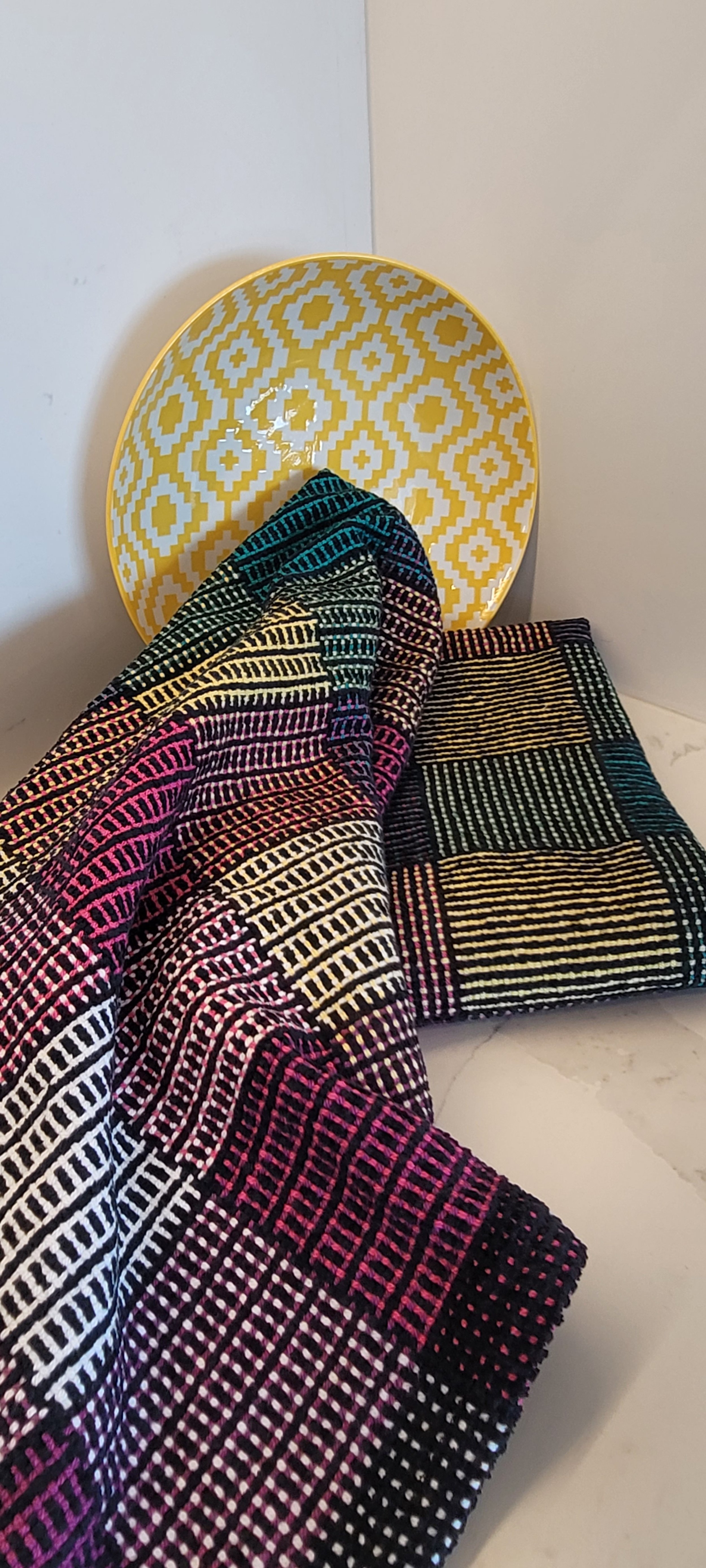
I live in a province that delights in colour. Like many ocean communities, we have old towns with old houses painted in bright colours (think Jelly Bean houses). So my next suggestion is to take note of the colour combinations around you. Take pictures and set up an album of colour combinations. It might be a piece of art, a row of houses, packaging, even a plate of food!
Finally, my last bit of advice is to get out of your comfort zone. We all have colours we are drawn to. (If you aren’t sure what colours are your go-to’s, organize your closet by colour, your favourites will be easy to see!) Deliberately choose colours you wouldn’t normally use. A great start is a skein of sock yarn in colours you don’t usually pick. Sock yarn is great because it is relatively easy to find a matching weft, just pick one colour from the sock yarn. Noro yarn is another great option…Noro skeins seem to have every colour and still look great!
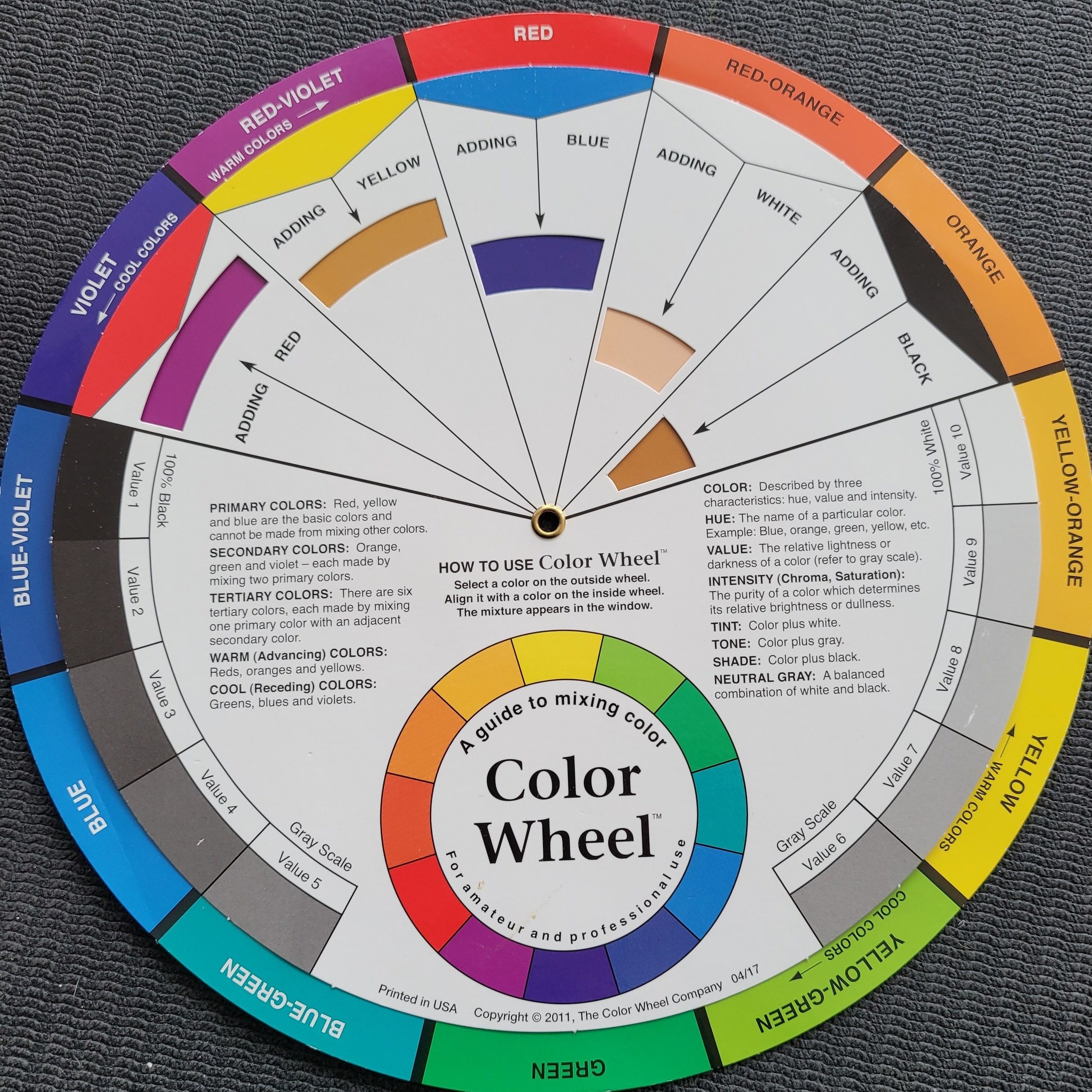
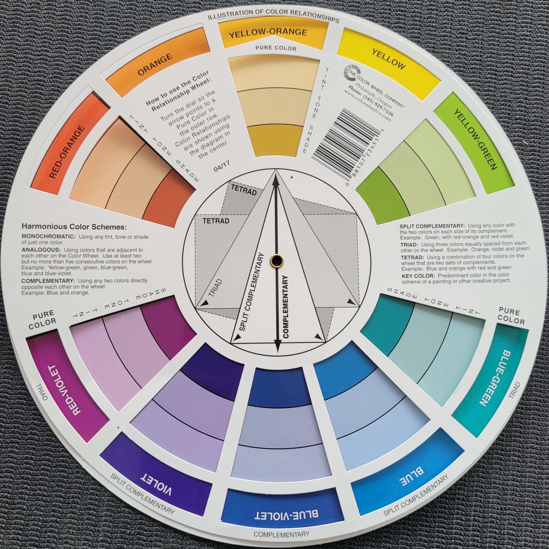
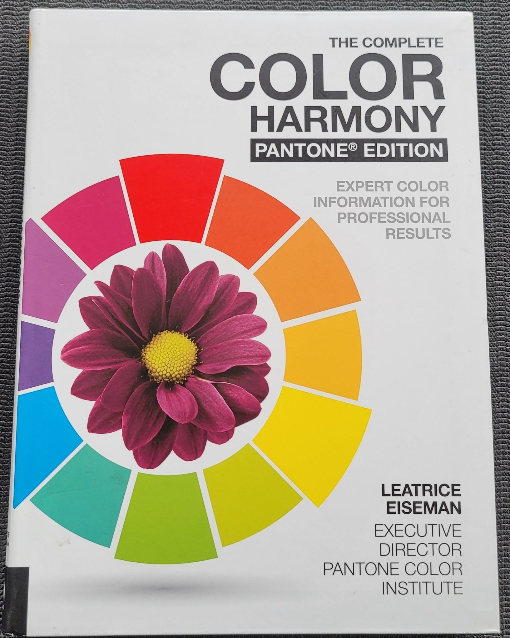
I have a few physical resources I use too. I of course have a professional colour wheel. It helps me when I want to mix colours I would not usually put together. or finding a good “pop” colour. I also have a book, which while it has great information, and I did read it, I use mostly for the colour combinations! This book (The Complete Color Harmony Pantone Edition) is divided into “Moods” and has dozens of 3-5 colour combinations and even proportions! It is a fabulous book to add to your library.
Want to try some colourful projects? Check out these patterns! Each of these are bright cheerful patterns. Some put together surprising combinations, some will show how colours play together and some show the difference weft can make. Each will challenge you colour-wise but all will give you a beautiful set of tea towels to enjoy! Click on the images for more details and to purchase.